Design Influences: Josef Müller-Brockmann

LeBron James makes it look so easy. (Okay, Stephen Curry might have made it look even easier at this year’s NBA finals.) They fly though the air, with the greatest of ease, and get middle schoolers and middle agers all over the world jumping and slam-dunking. Maybe that’s a definition of brilliance: performance so seemingly simple and effortless anyone who witnesses it wants to give it a try.
(This is Part 3 in our profiles of Grady Campbell creative influences. “The Thinkers”–Swiss Design: Josef Brockmann.)
Josef Muller-Brockmann (1914-1996) was a 5-foot-something design legend in a dignified tweed suit and occasional bowtie–more of a Clark Kent or Peter Parker than a superhero or superstar. But his deceivingly brilliant work made the world believe it was so easy anyone could do it.
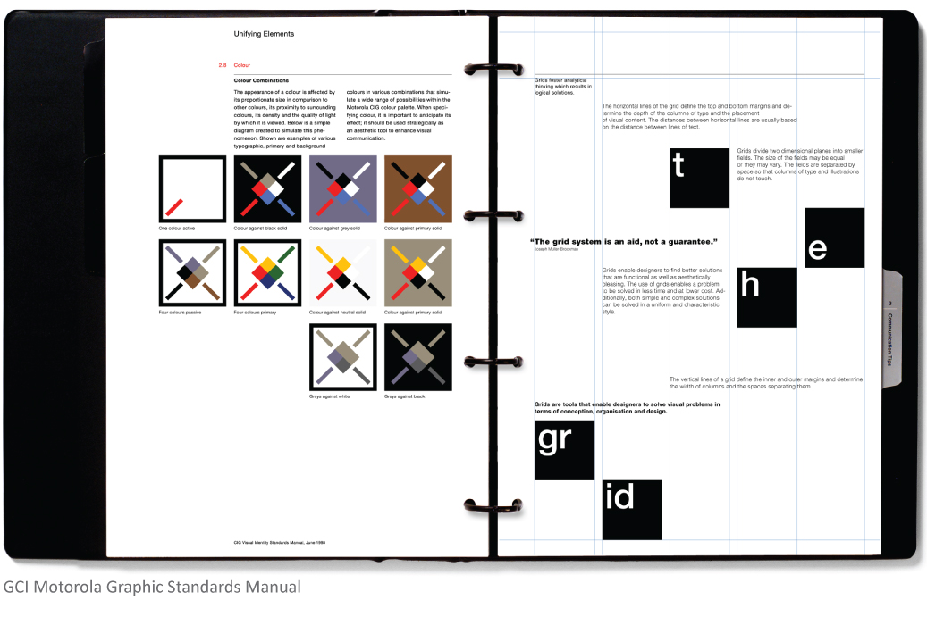
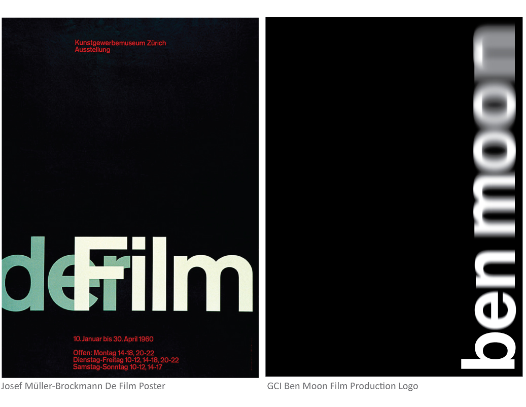
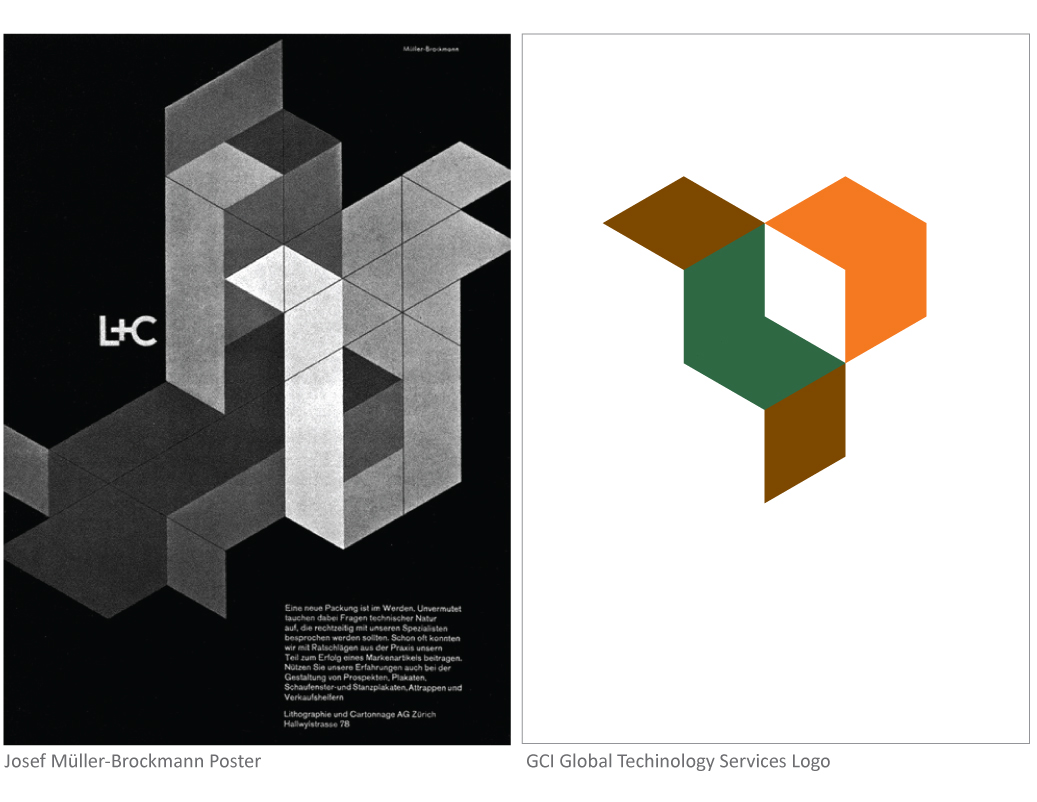
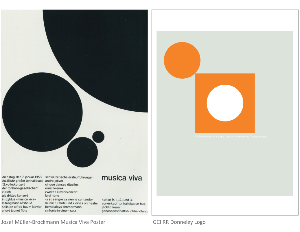
Brockmann was the protagonist of the Swiss School, known for disciplined, restrained, radically modernist geometric design (with the intricacy of a Swiss timepiece.) Primary colors were his palette of choice, with high impact black and white and what was regarded as the perfect typeface for any purpose: Helvetica. Brockmann is best known for introducing an almost scientific grid system to graphic design. Classical structural formulas used by artists of the past were turned on end (sometimes literally) by this modern solution for page structure.
He approached a blank page in much the same way one might plan a city street. Rectilinear avenues of typography led to precisely placed images, and became every bit as important. Only careful study of the final result could reveal the ingenious path to achieve it.
But a design diva Brockmann was not, describing himself and his work in downright self-deprecating terms. He said he became a graphic designer “by accident,” padding his school compositions with illustrations to avoid writing more words. (A savvy teacher saw his talent and guided him to the arts.) Later it would be Brockmann’s work, and that of his own students and fellow artists, that helped define Switzerland’s cultural identity.
If Paul Rand was known as a tyrant taskmaster, Massimo Vignelli, a flashy romantic, Josef Brockmann was very much the kind mentor. Brockmann had an authentic commitment to what makes sense, and a genuine respect for every person’s unique way of deciding that. Kerry Grady came to know Brockmann through years of study and typography textbooks, but the two met personally at an AIGA–American Institute of Graphic Arts–national conference, (Kerry and the AIGA Board invited him to speak at another after that.)
Advances in technology have brought about an explosion in design. Anyone with Adobe Creative Suite might feel like Brockmann’s brilliance was right in the box. But most of his work was impressively by hand (not by mouse.)
Brockmann, ever the generous mentor, shared with Kerry his philosophy that great design is powerful. He told him a story of how he once refused to design cigarette packaging. “He didn’t want to beautify something devised to kill people,” Kerry says. Just as Voltaire put it (or Uncle Ben in Spiderman, if you remember that better.) “With great power comes great responsibility.” Maybe Brockmann was something of a superhero after all.


