Design Influences: Paul Rand

It’s like a scene from a movie, or soft drink commercial: young kid from anywhere, Iowa, stumbles upon his superstar idol. Superstar takes a liking to the kid… gives him inspiring advice he’ll never forget (or maybe throws him a team jersey in exchange for a “Coke and a Smile”)…roll credits. Only this is a true story. The kid’s not exactly a kid any more, the superstar isn’t wearing a football jersey (more like thick eyeglasses) but the memorable connection and unforgettable brush with greatness parts are totally true.
It’s the story of Kerry Grady, a young designer and, at the time, a University of Illinois design professor. He met and connected with legendary icon of Modernist Design Paul Rand. (This begins our series of profiles on Grady Campbell’s creative influences.)
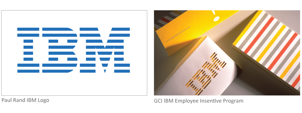
Paul Rand is most widely known for creating corporate identities for three-letter giants that have become household names, like IBM, ABC, UPS. Many of Rand’s ideas and creations are still in use today. Equal parts artist, idealist and realist, Rand defined graphic design as a corporate tool and a professional imperative.
Stories of Rand’s relentless drive and perfectionism might bring to mind a tough taskmaster, but Kerry found Paul Rand to be a witty, charming, kindred spirit. “People were almost honored to receive a challenge from Rand. That meant he saw potential in you.” The two sat down for several hours of conversation about form and function and how informed creative decisions are the foundation of the design process. Design had to make sense.
Paul Rand’s career spanned six decades of design, but his work looks as fresh today as when it was introduced so many years ago. Rand wasn’t only one of the world’s greatest graphic designers; he was an educator, a longtime professor at Yale University School of Art, where generations of students have been influenced by his creativity, philosophy and rigor. He was also an author of design bibles such as “A Designer’s Art” (three copies of which Kerry wore through the bindings.) Though Kerry Grady never studied under Rand per se, like countless others, he learned from Rand’s teachings and examples. They shared a design philosophy and aesthetic, and occasionally, they shared the same client. One of the last corporate logos Rand designed was for Morningstar. When Morningstar needed a design team to help introduce its 401k platform to the marketplace, Rand and his teaching associate, Philip Burton, recommended Grady Campbell.
Kerry Grady’s encounter with Paul Rand that day wasn’t just “idol chatter.” It was influential in his foundation as a designer and a teacher, and the underpinning of a respect and reasoning he affords every project today. Purposeful design lives on in Kerry, and Grady Campbell. As Rand once put it, “You can be a great manipulator of form, but if the solution is not apt, it’s for the birds.”


